Brand Guidelines Template: What to Include
Guidelines should help someone make a decision, not just display a logo. Read the seven sections, a worked example, and what to leave out.
Brand guidelines often fail because they document appearance without explaining decisions. A team can follow every rule and still produce work that feels off-brand, because the guidelines never said what the brand means or how to resolve a conflict between consistency and clarity.
Direct answer: A useful guideline includes the brand's core idea, audience, voice principles, visual system, usage rules with examples, accessibility requirements, and a decision rule for cases the document does not cover. Brand-management principles treat this as maintaining identity across touchpoints, and the brand-consistency article distinguishes what must travel intact from what should adapt. The boundary: a guideline is a tool for making decisions, not a substitute for judgement — if it tries to specify every case, it becomes unusable.
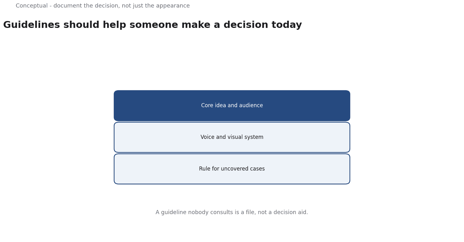
Seven sections
1. The core idea. One or two sentences on what the brand stands for and the value it promises. Everything else should be traceable to this.
2. Audience and context. Who the brand speaks to and in what situations. This is what allows tone to adapt without drifting.
3. Voice principles. Three or four principles with examples of good and bad copy. "Friendly but not casual" is a start; showing the difference in a support reply is a rule.
4. Visual system. Logo, colour, typography, and layout with the reasoning behind each choice. A colour code without a usage context invites misuse.
5. Usage rules. What is required, what is discouraged, and what is forbidden — with images. Examples of wrong usage are more instructive than abstract rules.
6. Accessibility. Contrast requirements, minimum text sizes, and alternatives for colour-only meaning. These are constraints, not preferences.
7. Decision rule for gaps. When the guideline does not cover a case, who decides and what question do they ask? This is the section most documents omit, and the one that keeps them alive.
A worked example of a decision rule
The following is hypothetical and illustrative.
A team needs a cover image for a conference talk, a format the guideline does not mention. A rigid document either has no answer or a rule that does not fit. A useful decision rule says:
If the case is not covered, ask: does this use preserve the core idea, remain recognisable, and meet the accessibility constraints? If yes, proceed and record the decision. If no, ask the brand owner. Two examples of similar decisions are linked here.
Three consequences follow:
- The team can act without permission when the decision meets the stated test, which keeps the guideline usable at speed.
- Non-obvious decisions are recorded, so the next similar case has a precedent.
- The brand owner is consulted only for genuine conflicts, which keeps their time available for real decisions.
Three cautions apply: the core idea must be specific enough to test against, the accessibility constraints must be non-negotiable, and the recorded decisions need a place where people can find them.
Keeping the document usable
Three practices make it a working tool:
Keep it short enough to scan. The core idea, voice principles, and decision rule should fit on one page. Detailed specifications can live in linked templates, where they are closer to the work and easier to update.
Put the decision rule where work happens. A designer creating a social asset should see the gap rule next to the template, not in a separate handbook. The location of the guidance determines whether it is used.
Maintain a decision log. When someone applies the gap rule, record the case and the reasoning in a short entry. After a quarter, these entries show which parts of the guideline are unclear and should be clarified — a far better basis for revision than a periodic rewrite from scratch.
These habits treat the guideline as a living decision aid rather than a brand monument.
The test is simple: can a new team member make a defensible choice in five minutes without asking permission?
What to leave out
Exhaustive layout specifications. A document that dictates every spacing value discourages adaptation and goes stale when the product changes.
Tool-specific instructions. Software changes faster than a brand system. Link to current templates instead of embedding instructions that expire.
Claims without evidence. "Our audience loves bold colours" should be supported by research or labelled as a preference. If it came from a survey, state the population and wording as AAPOR's standards require.
Rules with no reason. A rule without a rationale cannot be applied to a new case. Explain why colour contrast matters; do not only state a value.
The counterargument — that shorter guidelines leave too much freedom — is fair when a brand is young.
The response is to keep the rules that prevent real errors and add new ones when a specific mistake repeats, rather than writing a comprehensive document nobody reads.
A decision test
- Write the core idea in one or two sentences.
- Name the audience and contexts where the brand appears.
- Give voice principles with examples, including what to avoid.
- Explain the visual choices, not just the values.
- Show right and wrong usage side by side.
- Make accessibility requirements explicit.
- Add a decision rule for cases the document does not cover.
For the consistency principle, see Brand Consistency Across Channels; for the design brief, see How to Brief a Designer.
References & Further Reading
- Wikipedia contributors, 2026. Brand management - Wikipedia — The discipline of maintaining a brand across touchpoints; secondary reference used for channel consistency.
- Wikipedia contributors, 2026. Marketing communications - Wikipedia — The coordination of messages across channels and the distinction between consistent and identical communication.