Landing Page Best Practices for B2B
A B2B landing page answers a buying committee, not a single visitor. Read the structure, a worked example, and the metric that matters.
A B2B landing page has a harder job than a consumer page. The visitor may be evaluating on behalf of a committee, may need to justify the choice to finance, and may return three times before converting. Advice borrowed from consumer pages — short copy, one button, urgency — often removes the information the buyer needs.
Direct answer:
A B2B landing page should state the problem and the outcome, show evidence a buyer can verify, address the objections that block a decision, and offer a next step proportionate to intent.
Marketing-communications principles govern consistency across channels, while demand generation explains the stage the page serves. The boundary: a page is one touchpoint in a long decision; it cannot be judged on immediate conversions alone.
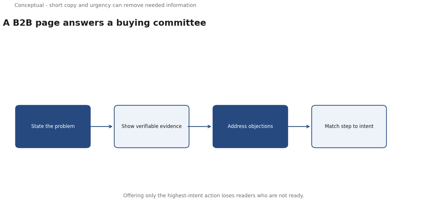
Four parts of the page
Problem and outcome. The first screen should tell a reader with the relevant problem what changes if they choose you. A vague headline about innovation gives them nothing to evaluate.
Verifiable evidence. Specific numbers with their context — a measured result, a named customer with permission, a documented method. A claim without a denominator invites scepticism from a buyer who will be asked to defend the choice.
Objection handling. B2B buyers worry about implementation effort, security, integration, and cost. A page that answers these questions reduces the work a champion must do internally. A comparison table or a short FAQ can carry this.
A next step matched to intent. "Book a demo" is appropriate for a late-stage visitor; "read the evaluation guide" suits an early-stage one.
A worked example of a page audit
The following is hypothetical and illustrative.
A vendor sells compliance software. Its landing page gets 5,000 visitors a month, 100 demo requests, and 20 qualified opportunities.
An audit asks three questions:
- Is the outcome specific? The headline currently says "Simplify compliance". A buyer cannot tell what improves. Rewriting it to state the measurable result — for example, the time to prepare an audit — would make the page easier to evaluate. The number must come from a real customer with permission, not an estimate.
- Are the objections answered? The page has no content on data residency or integration. If those are the reasons deals stall, the page should address them, or link to a page that does. The information a champion needs internally is part of the product's marketing surface.
- Is the next step matched? Every visitor sees "Book a demo". Adding a downloadable evaluation checklist gives early-stage readers somewhere to go. Track which path produces qualified opportunities, not just which produces more form fills.
Three decisions follow:
- Rewrite the headline around an outcome with evidence.
- Move the top two objections onto the page or into a clearly linked resource.
- Add a lower-intent path and measure opportunity quality by path.
Three cautions apply: the new headline needs a real number, the objection content must be accurate, and a test must change one element at a time, as the A/B testing article explains.
What a page cannot do
It cannot replace a sales process. A complex purchase involves conversations, security review, and procurement. The page supports that process by giving the champion material to circulate.
It cannot compensate for a weak product. A page that overpromises produces more demos and fewer closes, which is worse than fewer qualified visitors. Read the conversion metric alongside opportunity quality.
It cannot be all things to all segments. A page aimed at every industry usually speaks to none. Separate pages with distinct evidence are better than one broad page with generic claims.
The counterargument — that a landing page should be short — is true when the reader's decision is simple.
For a B2B purchase with a committee, length is not the problem; irrelevance is.
A long page that answers real objections outperforms a short one that does not.
A decision test
- Name the buying committee and the reader's role.
- State the outcome in the first screen, with evidence.
- Answer the top two objections with verifiable information.
- Offer a next step matched to intent — demo and evaluation content.
- Keep evidence consistent across the ad, the page, and the follow-up.
- Measure qualified opportunities by path, not form fills.
- Test one element at a time with a defined primary metric.
For the channel context, see SEO vs Paid Advertising; for the testing method, see A/B Testing.
References & Further Reading
- Wikipedia contributors, 2026. Marketing communications - Wikipedia — The coordination of messages across channels and the distinction between consistent and identical communication.
- Wikipedia contributors, 2026. Demand generation - Wikipedia — An overview of demand generation as a marketing discipline distinct from lead generation; secondary reference used with the lead-generation entry.