Visual Identity Systems: More Than a Logo
A logo is the smallest part of an identity. Read the system around it, a worked application, and why consistency is about decisions.
A visual identity is often treated as a logo with a colour palette attached. That is the visible tip of a system that has to work across a product interface, a legal document, a social post, and a storefront — contexts with very different constraints. The value of the system is that it lets someone make a new decision without asking the designer.
Direct answer: A visual identity system is a set of rules for colour, type, layout, imagery, and usage that expresses a brand across contexts. Brand-management principles treat it as a maintained asset, and the brand-guidelines article covers what such a document should contain. The boundary: a system cannot create a good product or a clear promise, which the value-proposition article argues, and a system followed mechanically can still communicate the wrong thing.
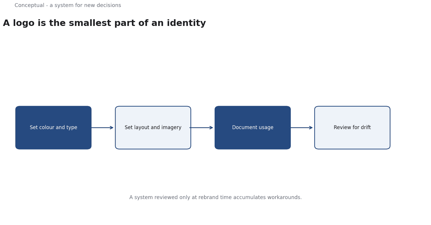
What the system contains
Foundations. Colour, typography, spacing, and imagery rules, each with a rationale, as Brand Guidelines Template: What to Include recommends for rules that can be applied to new cases.
Application. How the foundations appear in specific contexts — a product interface, a document, a social post, a physical space. The brand-consistency article distinguishes what must travel intact from what should adapt.
Accessibility. Contrast, text size, and non-colour signals. These are constraints, not preferences, as the technical-writing article treats accessibility for documentation.
Decision rule. What to do when the system does not cover a case, which the brand-guidelines article identifies as the section most documents omit.
A worked application
The following is hypothetical and illustrative.
A company applies its identity to a new feature announcement across three contexts:
- In-product banner. Uses the primary colour and type scale, with accessible contrast and a short message, as the accessibility rules require.
- Social post. Adapts the layout to a square format and leads with the same claim, as Brand Consistency Across Channels: What Must Match recommends for channel fit.
- Sales document. Uses the same colour and type, but a denser layout suited to print, with the evidence the landing-page article recommends for B2B.
Three checks decide whether the system works:
- Recognition — would a reader identify all three as the same source? The brand-awareness article treats recognition as a measurable signal.
- Fit — does each application work in its context, or is it a layout forced into a format, as the social-media calendar article warns?
- Decision ease — could a new designer produce a fourth application without asking, which the brand-guidelines article treats as the purpose of the decision rule?
Three conclusions follow:
- The system enables decisions, which is its value, as the design-brief article argues for specifications that support judgment.
- Consistency is about meaning, not identical layout, which the brand-consistency article explains.
- Accessibility is a constraint on every application, which the guidelines article treats as non-negotiable.
Maintaining the system
A system that is never reviewed accumulates exceptions until it no longer guides anyone.
Three practices keep it alive:
Keep an exception log. When someone applies the system to an uncovered case, record the decision and the reasoning. Over time these entries show which parts of the system are unclear, which the brand-guidelines article frames as the basis for revision.
Review at change points. A new product, channel, or acquisition changes the applications the system must support, which the monitoring article treats as a trigger. A review tied to change is more useful than an annual refresh.
Own it with authority. Someone must be able to update a rule and communicate the change, which the governance checklist requires for any maintained standard.
These practices are the difference between a system people use and a document they ignore, which the brand-guidelines article treats as the central test.
What a visual system cannot do
It cannot fix positioning. A distinctive look around an unclear promise still leaves the buyer unsure, which the value-proposition article argues.
It cannot substitute for product quality.
A polished identity around a poor experience accelerates disappointment, which the brand-positioning article treats as a credibility problem.
It stays current only with maintenance.
The counterargument — that a logo is all a small team needs — is fair at the very start and becomes costly as channels multiply, which the brand-guidelines article explains for growing organisations.
A decision test
- State the core idea the system should express, as Brand Guidelines Template: What to Include recommends.
- Define foundations with rationale, not just values.
- Specify applications for the contexts you actually use, as Brand Consistency Across Channels: What Must Match advises.
- Make accessibility non-negotiable.
- Add a decision rule for uncovered cases, which the guidelines article treats as essential.
- Test recognition and fit on real applications, as the brand-awareness article recommends.
- Review on change in product or channels, which the monitoring article covers.
For the document, see Brand Guidelines Template; for the coordination, see Brand Consistency Across Channels.
References & Further Reading
- Wikipedia contributors, 2026. Brand management - Wikipedia — The discipline of maintaining a brand across touchpoints; secondary reference used for channel consistency.
- Wikipedia contributors, 2026. Marketing communications - Wikipedia — The coordination of messages across channels and the distinction between consistent and identical communication.